Creating a Journal Page Embellishment
This tutorial will walk you through creating a realistic-looking journal page for use in scrapbooking layouts. I am using Photoshop CS3, but you can modify the tutorial for use in PSE or PSP easily.
There are many ways to create journal pages; this is merely the way I do it. I don’t always follow this procedure, but I have found that this is the one that allows for the most flexibility and different looks in my elements.
The first thing that I’m going to do is rip a piece of construction paper and scan it. For best results, I put a piece of black paper behind it, so that it scans nicely.
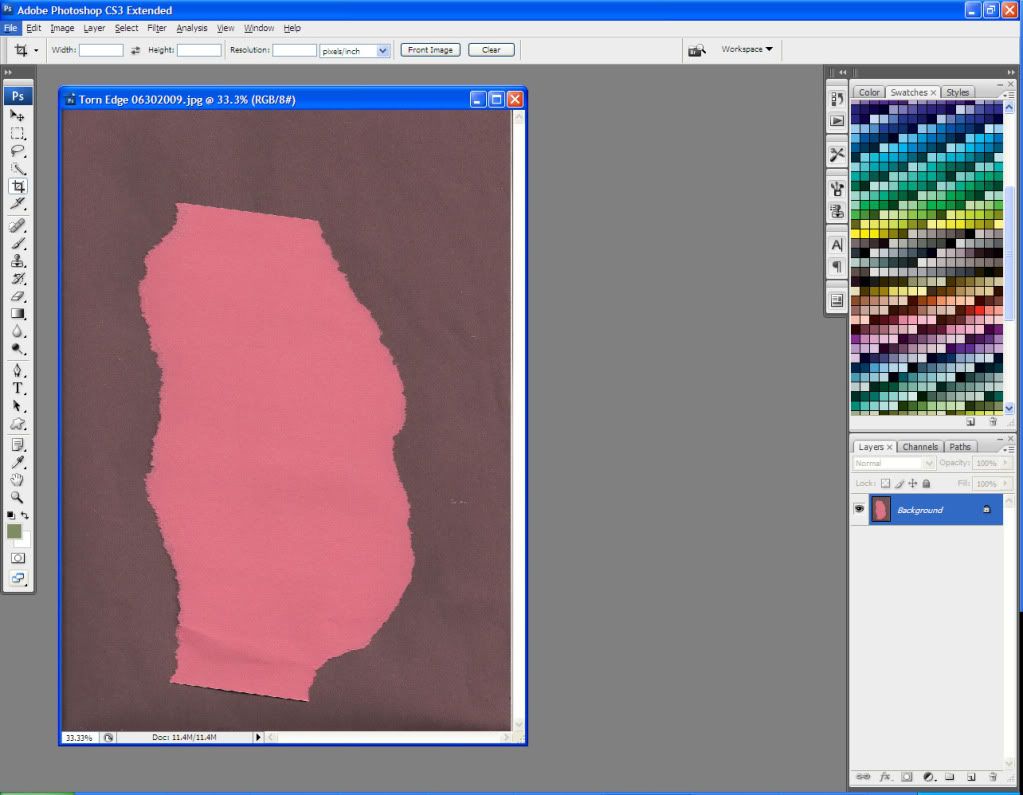
Now I go to Filter > Extract and run the highlighter around one edge of my paper.
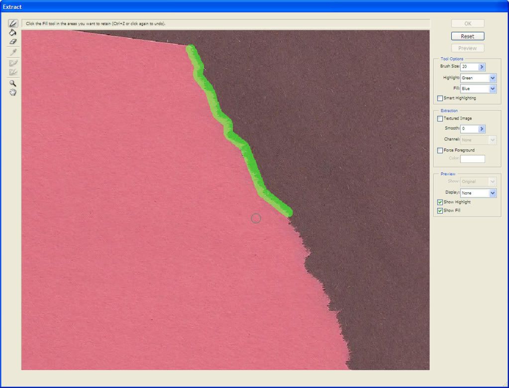
Keep the highlighter diameter small and try not to include too much of the black background. Tip: Hold down the shift key and click along the edge, and it will create a continuous line.
Now I finish my outline – I’m just outlining the one side for now – and use the Fill tool to fill my selection. I click OK and here is my result:
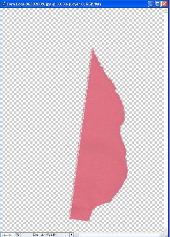
I move it around (Ctrl + T to transform) and clean up that left hand edge (use rectangular marquee, select inverse, then clear). I then Ctrl + left click on the layer thumbnail to select the edge.

Now I go to Edit > Define Brush Preset, and give it a name. I’m going to name this Torn Edge 1 0630 just so I can find it later.
Now I’m going to extract the other torn side of my original image.
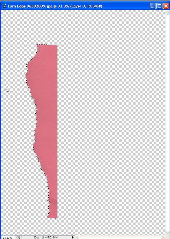
Now that I’ve created my brushes, I can close these images.
I open a new document, 12 inches by 12 inches, 300 dpi, transparent background. I like to work larger and then size down if needed. I mark out a rectangle using the rectangular marquee tool, and fill it with my choice of color.
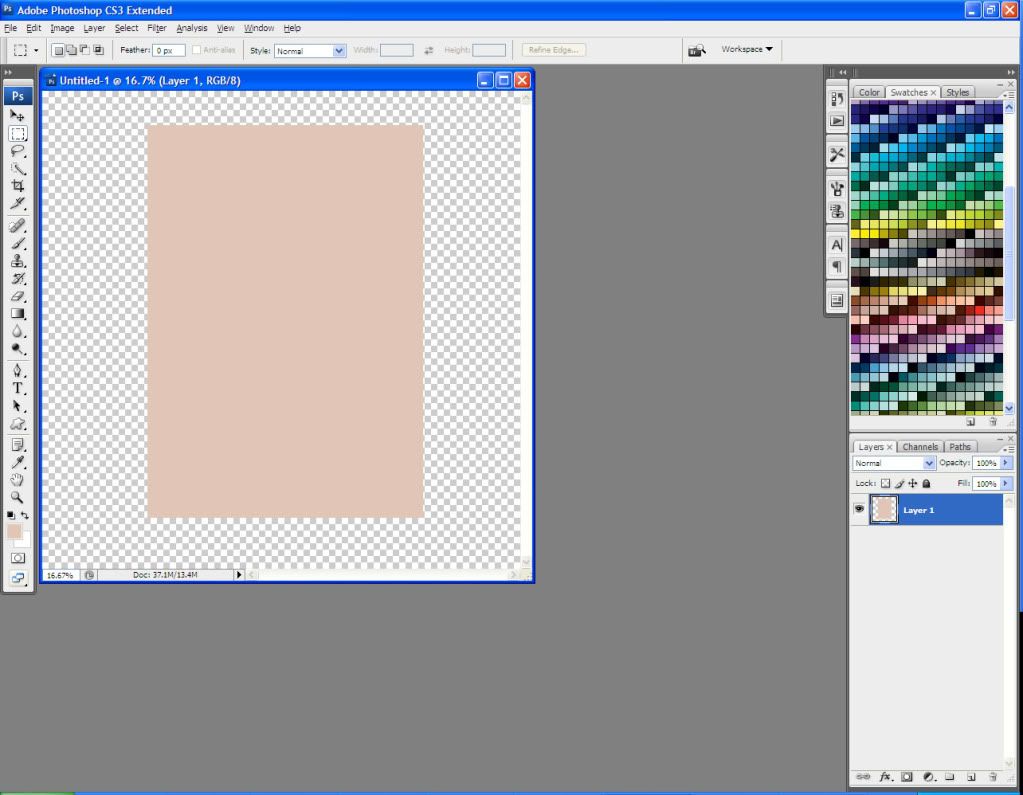
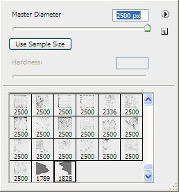
Now I select my Eraser tool and scroll to the bottom of my brush presets. The two torn edge brushes that I created are at the bottom. I pick one and set the size to match the edge of the rectangle on my image.
Now I click around the outside edge of my rectangle, erasing parts of it in a random torn pattern.
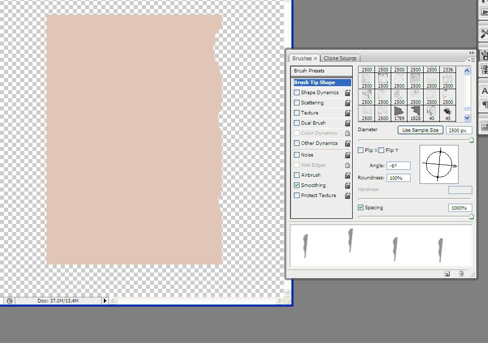
Note that I change the direction of my brush in the Brushes palette so that I can erase the various sides of the rectangle. I moved my spacing out to 1000% so that I can see in the preview window what my brush’s angle is before I start to erase.
Now that I’ve got my rectangle erased on all 4 sides, I can add some detail.
This particular journal page is going to go in my Eats Shoots and Leaves kit, so I’m going to use a swirly floral brush. I create a new layer and use a coordinating dark color. The 2 vine brushes that I’m using are from RajRaja’s Little Garden collection.
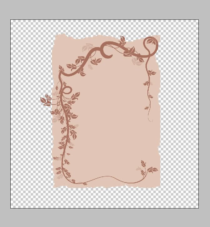
I’m sure you’ve noticed that my vines go outside the lines of my base page. That’s ok, because I want my journal page to look torn and weathered. I Ctrl + left click on the layer thumbnail for my base page, then go to Select > Inverse and, making sure that my vine layer is selected, I hit the Delete key. This will clear any excess vine that’s outside the margin of the journal page.
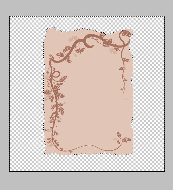
Now I add some lines to make it look like a writing page. These will go on a new layer in the same dark color as the vines. You can probably find brushes out there on the Internet to slap the lines on there, but I just draw them by hand.
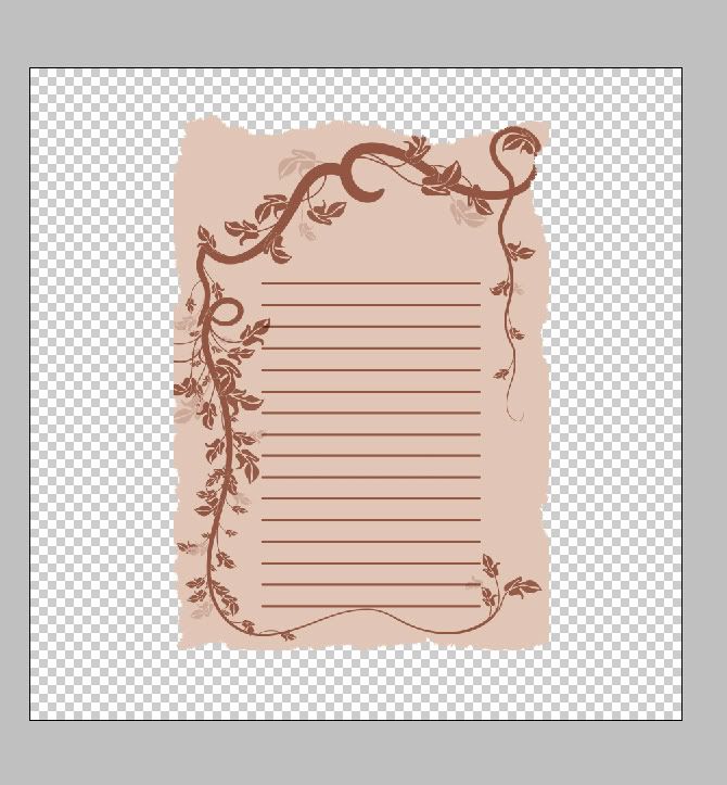
Now I choose a large, soft eraser brush and go around the edges of the lines, to fade them a wee bit and make them look like part of the page.
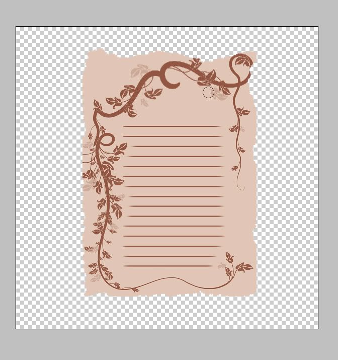
At this point, I merge my lines and vines layers and fade them a small amount – my fill opacity is at 78% for the new layer. I change the Blending Mode of this layer to Multiply.
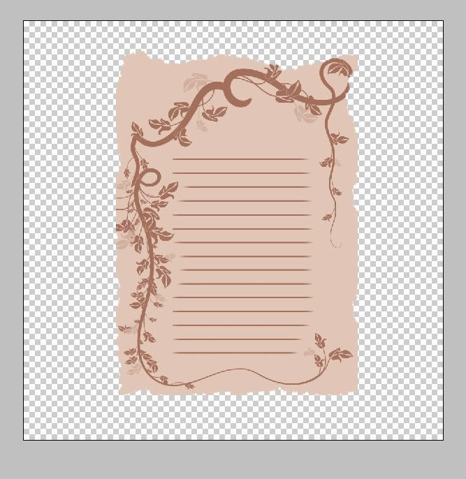
Now I’m going to add some grunge to make the paper look old. I create a new layer and select a grunge brush. The brush I’m using comes from Mystikel’s excellent Covered Grunge set. I pick a new color that compliments my other 2 colors, but is slightly different.
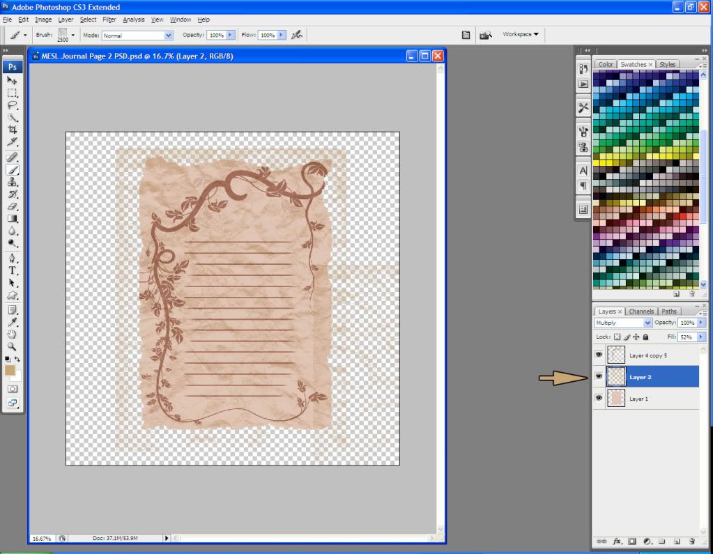
Note that I placed this layer between my base layer and my lines-n-vines layer.
I set the Blending Mode of this grunge layer to Muliply and the Fill Opacity to 52%. Now I Ctrl + left click on the layer thumbnail for the base layer, and then go to Select > Inverse. I make sure my grunge layer is selected, and hit the Delete key to clear all of it that’s outside the lines.
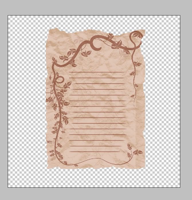
This page is looking pretty good, but I want to add just a wee bit more realism. I’m going to merge all of my layers at this point.
Using the Lasso tool, I select a small section of the page edge. I right click on the selection and select “”Layer Via Copy.” On this new layer, I Edit > Transform > Warp and move the small piece around until it looks like the page edge is curling.
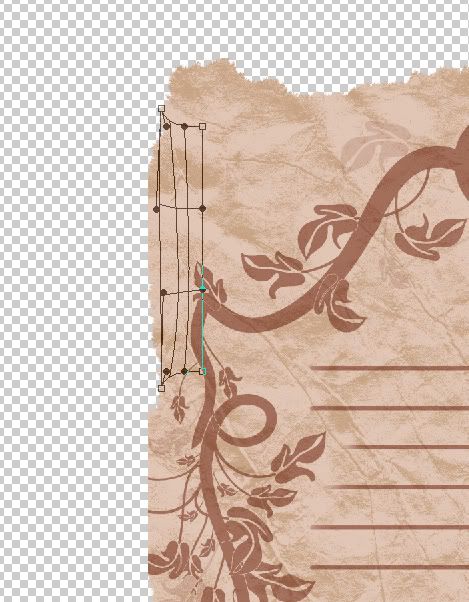
Now I carefully erase the base layer section that is beneath this new layer. On the new layer, I add a Drop Shadow as follows:
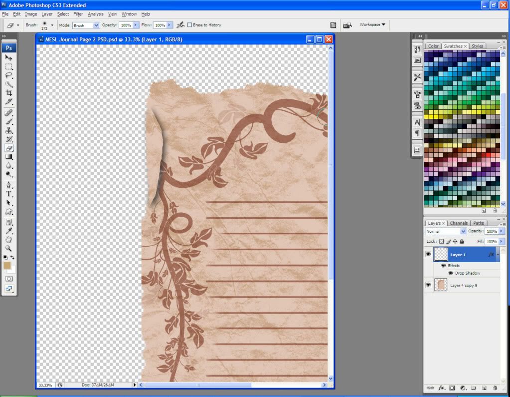
Now I Edit > Transform > Warp the new layer again until it looks more realistic.
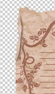
This definitely takes some trial and error, and isn’t necessary to create a standard journal page. I just like the added realism. You can do this multiple times on the base page to make it look like it’s curling all around the edge, but don’t overdo it.
Here’s my completed journal page!

I’m pretty happy with it, so I Image > Trim and trim by transparent pixels. I’m going to resize mine to 1500 pixels high by 1073 pixels wide, because I find that large journal pages are huge files in terms of MB, and that can make a scrapbooking kit take many .zip files to contain all of the embellishments. I also merge all of my layers before saving it as a .png file.
I hope that this tutorial has helped you learn to create great journal pages, and also given you some ideas for new things you can try on your own. Suggestions, questions, and feedback are always welcome at maitri@mchsi.com or via MaitriScraps on AOL IM. Happy scrapping!
You can download the journal page that I created in this tutorial, as well as all of my torn edge brushes, here.
Happy scrapping!
This tutorial will walk you through creating a realistic-looking journal page for use in scrapbooking layouts. I am using Photoshop CS3, but you can modify the tutorial for use in PSE or PSP easily.
There are many ways to create journal pages; this is merely the way I do it. I don’t always follow this procedure, but I have found that this is the one that allows for the most flexibility and different looks in my elements.
The first thing that I’m going to do is rip a piece of construction paper and scan it. For best results, I put a piece of black paper behind it, so that it scans nicely.

Now I go to Filter > Extract and run the highlighter around one edge of my paper.

Keep the highlighter diameter small and try not to include too much of the black background. Tip: Hold down the shift key and click along the edge, and it will create a continuous line.
Now I finish my outline – I’m just outlining the one side for now – and use the Fill tool to fill my selection. I click OK and here is my result:

I move it around (Ctrl + T to transform) and clean up that left hand edge (use rectangular marquee, select inverse, then clear). I then Ctrl + left click on the layer thumbnail to select the edge.

Now I go to Edit > Define Brush Preset, and give it a name. I’m going to name this Torn Edge 1 0630 just so I can find it later.
Now I’m going to extract the other torn side of my original image.

Now that I’ve created my brushes, I can close these images.
I open a new document, 12 inches by 12 inches, 300 dpi, transparent background. I like to work larger and then size down if needed. I mark out a rectangle using the rectangular marquee tool, and fill it with my choice of color.

Now I select my Eraser tool and scroll to the bottom of my brush presets. The two torn edge brushes that I created are at the bottom. I pick one and set the size to match the edge of the rectangle on my image.

Now I click around the outside edge of my rectangle, erasing parts of it in a random torn pattern.

Note that I change the direction of my brush in the Brushes palette so that I can erase the various sides of the rectangle. I moved my spacing out to 1000% so that I can see in the preview window what my brush’s angle is before I start to erase.
Now that I’ve got my rectangle erased on all 4 sides, I can add some detail.
This particular journal page is going to go in my Eats Shoots and Leaves kit, so I’m going to use a swirly floral brush. I create a new layer and use a coordinating dark color. The 2 vine brushes that I’m using are from RajRaja’s Little Garden collection.

I’m sure you’ve noticed that my vines go outside the lines of my base page. That’s ok, because I want my journal page to look torn and weathered. I Ctrl + left click on the layer thumbnail for my base page, then go to Select > Inverse and, making sure that my vine layer is selected, I hit the Delete key. This will clear any excess vine that’s outside the margin of the journal page.

Now I add some lines to make it look like a writing page. These will go on a new layer in the same dark color as the vines. You can probably find brushes out there on the Internet to slap the lines on there, but I just draw them by hand.

Now I choose a large, soft eraser brush and go around the edges of the lines, to fade them a wee bit and make them look like part of the page.

At this point, I merge my lines and vines layers and fade them a small amount – my fill opacity is at 78% for the new layer. I change the Blending Mode of this layer to Multiply.

Now I’m going to add some grunge to make the paper look old. I create a new layer and select a grunge brush. The brush I’m using comes from Mystikel’s excellent Covered Grunge set. I pick a new color that compliments my other 2 colors, but is slightly different.

Note that I placed this layer between my base layer and my lines-n-vines layer.
I set the Blending Mode of this grunge layer to Muliply and the Fill Opacity to 52%. Now I Ctrl + left click on the layer thumbnail for the base layer, and then go to Select > Inverse. I make sure my grunge layer is selected, and hit the Delete key to clear all of it that’s outside the lines.

This page is looking pretty good, but I want to add just a wee bit more realism. I’m going to merge all of my layers at this point.
Using the Lasso tool, I select a small section of the page edge. I right click on the selection and select “”Layer Via Copy.” On this new layer, I Edit > Transform > Warp and move the small piece around until it looks like the page edge is curling.

Now I carefully erase the base layer section that is beneath this new layer. On the new layer, I add a Drop Shadow as follows:

Now I Edit > Transform > Warp the new layer again until it looks more realistic.

This definitely takes some trial and error, and isn’t necessary to create a standard journal page. I just like the added realism. You can do this multiple times on the base page to make it look like it’s curling all around the edge, but don’t overdo it.
Here’s my completed journal page!

I’m pretty happy with it, so I Image > Trim and trim by transparent pixels. I’m going to resize mine to 1500 pixels high by 1073 pixels wide, because I find that large journal pages are huge files in terms of MB, and that can make a scrapbooking kit take many .zip files to contain all of the embellishments. I also merge all of my layers before saving it as a .png file.
I hope that this tutorial has helped you learn to create great journal pages, and also given you some ideas for new things you can try on your own. Suggestions, questions, and feedback are always welcome at maitri@mchsi.com or via MaitriScraps on AOL IM. Happy scrapping!
You can download the journal page that I created in this tutorial, as well as all of my torn edge brushes, here.
Happy scrapping!

No comments:
Post a Comment