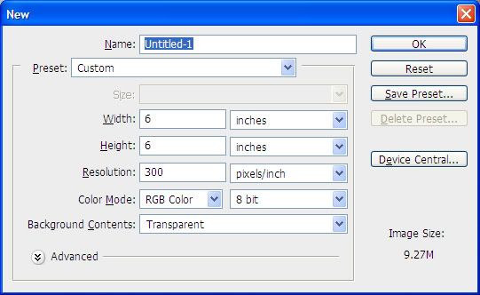
Create a new document with the following settings:
Using the elliptical marquee, create a perfect circle by holding down the Shift key and dragging it out. Fill the circle with the color of your choice. In my screenshots, you can see the palette I’m working with.
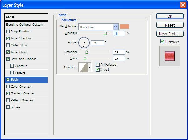
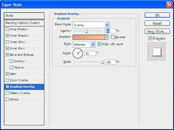
Now edit the Layer Style of your circle (the fx on your layers palette or Layer > Layer Style > Blending Options) with the following settings. Note that you can use whatever colors and settings you want – this is just what I’m doing with this particular button:
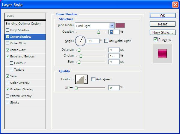
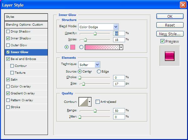
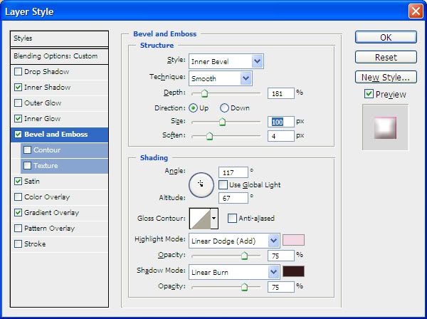

Here is my result using the above settings:
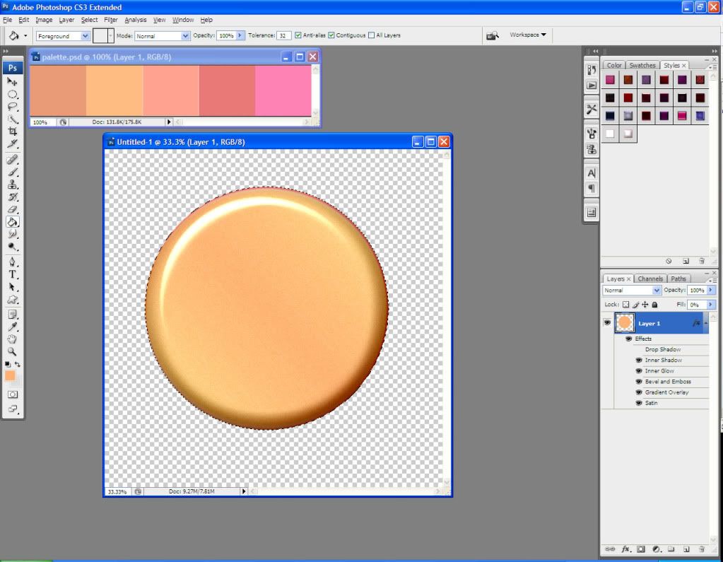
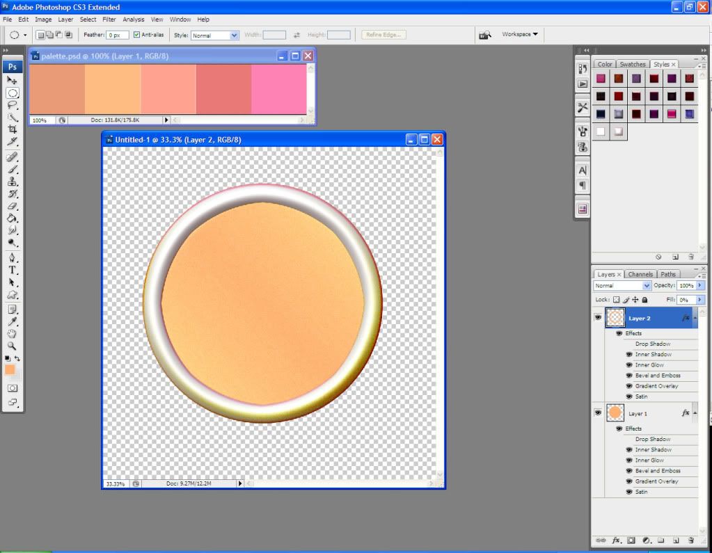
Now I select the circle by Ctrl+Left Clicking on the layer’s thumbnail in my layers palette. I go to Select > Modify and modify the selection by about 100 pixels. I go to Select > Inverse and then I Layer Via Copy (right click in the empty space should bring up a menu where you can select the Layer Via Copy option).
This creates a ring around my original circle that has the same layer style that we assigned to the circle:
I want to edit the layer style a bit, so I change these settings:
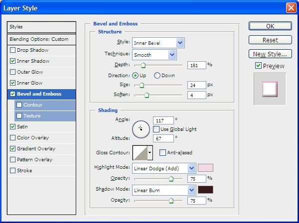
Now my layer styles are the way I want them. With my border layer active, I create a new layer and move it below the border layer:
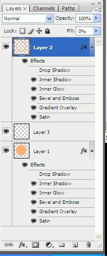
I now can merge the border layer and the empty layer together (Ctrl+E).
Do not do this with the base circle layer just yet.
On my base circle layer, I use the elliptical marquee tool to create a button hole. Again, hold down the Shift key while dragging the marquee tool, in order to make the circle perfect. Once I have it in the spot I want, I hit the Delete key to clear it.
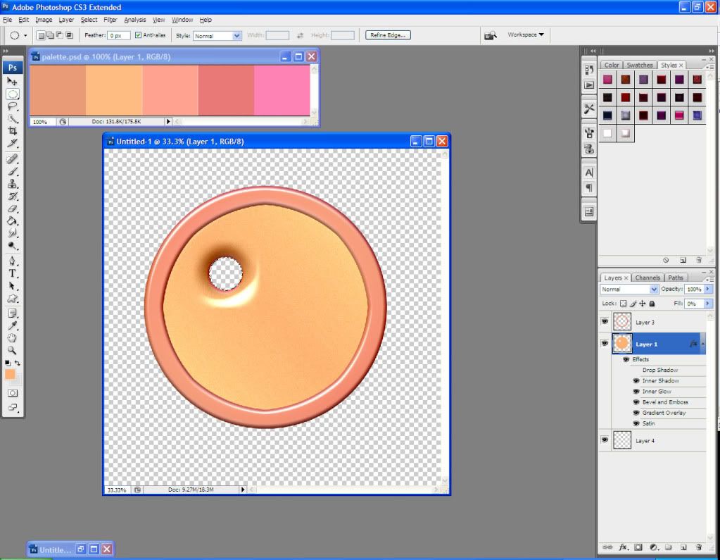
Using the arrow keys, I move my marquee circle around and keep hitting the Delete key until I’ve made all 4 of my button holes. I usually have to Undo (Ctrl+Z) several times if it doesn’t look like the holes are lined up right. Undo is your friend!
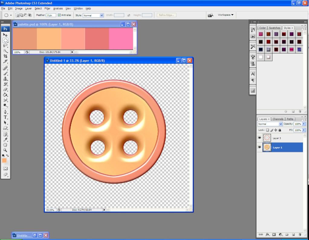
I can now create a new layer, move it below my base circle layer, and Merge (Ctrl+E) the two layers together. This sets the layer style so it can’t be altered.
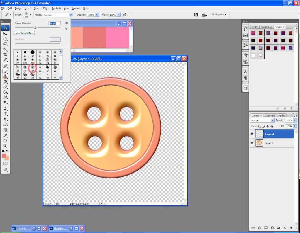
My next step is to create some yarn for the button holes. I set my foreground and background colors to colors from my palette, and select my Brush tool in the scattered brush, around 60 pixels:
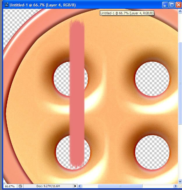
I create a new layer. Holding down the Shift key to keep a straight line, I draw a short line with my foreground color. The edges are a little jagged, so I erase the very edges to make them nice and straight (again, hold down the Shift key for a straight line):
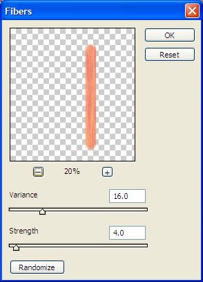
I duplicate this layer. With the duplicated layer active, I go to Filter > Render > Fibers and use these settings:
I play around with the Layer Properties of this duplicate layer until it has the look I want. In this case, I set the blending mode to Overlay. Once I’m happy with the look of the fibers, I can Merge the two yarn layers.
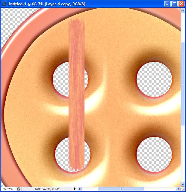
Now I transform the yarn to turn it around and shorten it so that it matches up with the button holes. At this point, I create a new layer, move it below all of the other layers, and fill it with black, just so I can see the detail up close. I zoom in for this part, and erase any part of the yarn that I don’t need.
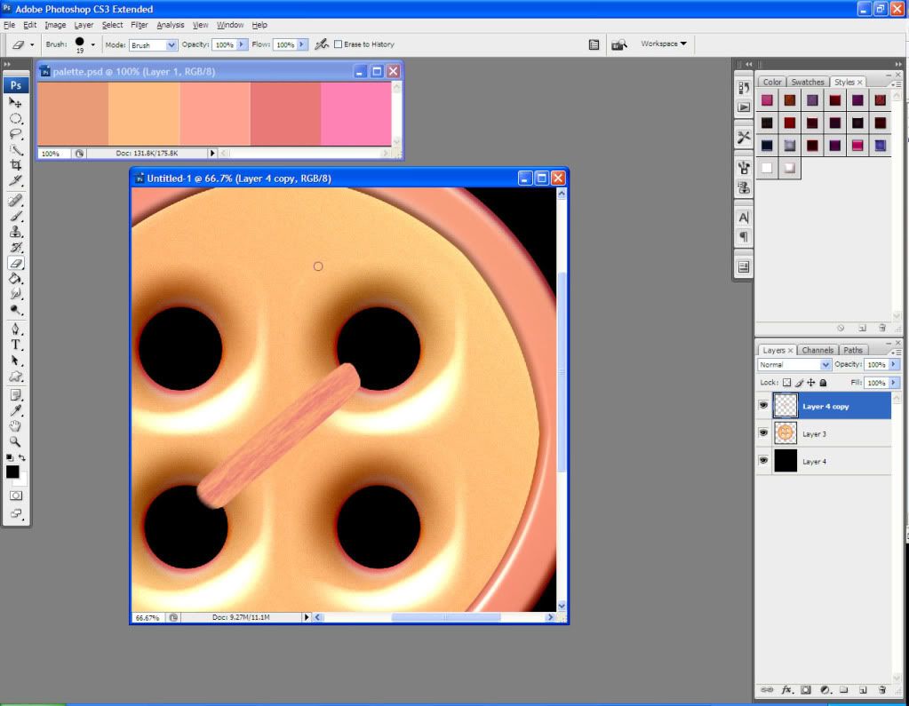
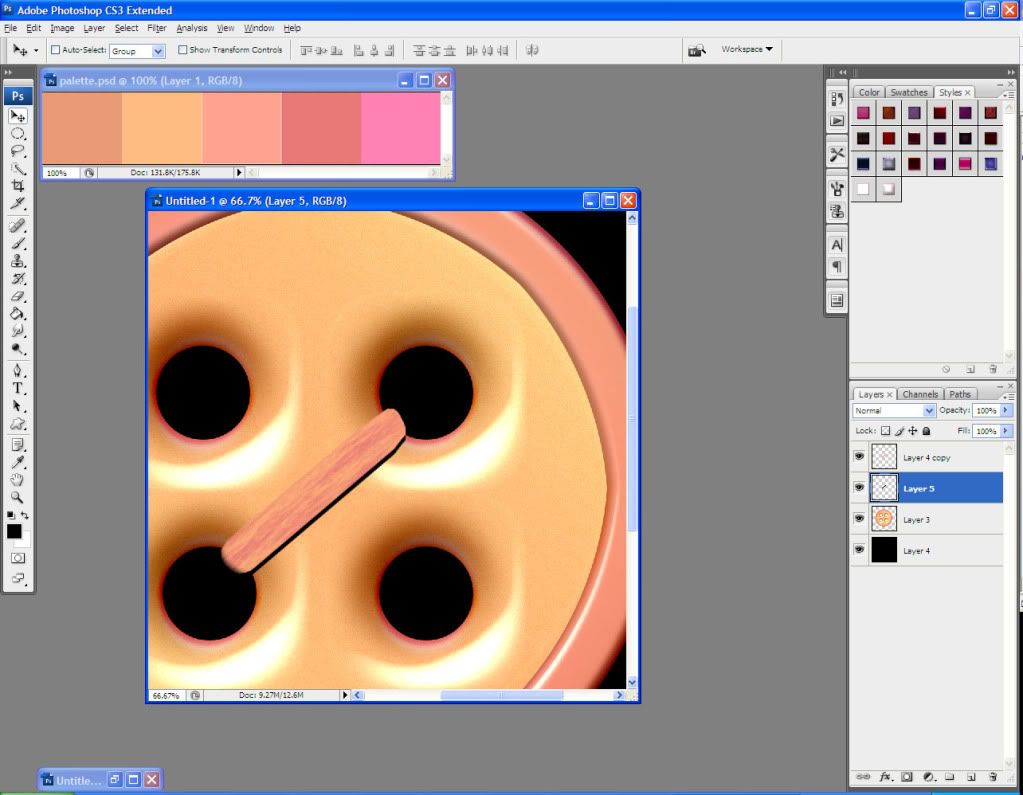
Now I want to create some depth. I select my yarn by Ctrl+Left Clicking on the thumbnail in the layer palette. I create a new layer and move it below my yarn layer, and then on the new layer I fill the selection with black.
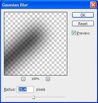
I go to Filter > Blur Gaussian Blur and use these settings:
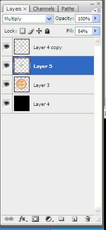
It’s too dark, so I change the blending mode on my shadow layer to Multiply, and the Fill Opacity to around 50%
I select the button base by Ctrl+Left Clicking on the thumbnail in the layers palette. I go to Select > Inverse and, making sure that I have my yarn’s shadow’s layer active, I hit the Delete key. What this does is eliminates all of the shadow that isn’t on the button. This way you don’t have extra shadow lingering behind your elements in your layouts.
I duplicate my yarn layer and turn it around so it connects the other two button holes. I repeat the procedure with creating a shadow for this yarn layer. I repeat the process of selecting the object below it, selecting the inverse, and deleting excess shadow.
I create four pieces of yarn and use the Edit > Transform > Warp tool on each one to make them look unique and more like yarn.
Now that I have my yarn the way I want it, I can combine all of the yarn and yarn shadow layers.
I now want to add some prettiness to my button. I create a new layer and use the Brush tool and some random brushes to paint pretty shapes over the top of the button (in this case I am using RajRaja’s Little Garden brush and DP’s Retro Circles brush).
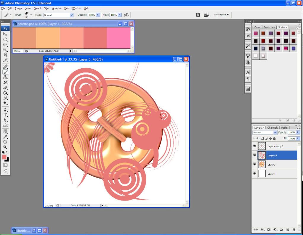
I select the button by Ctrl+Left Clicking on its thumbnail in the Layers palette. I go to Select > Inverse and, making sure that I have the painted shapes layer active, I hit the Delete key to clear all of the unneeded brush strokes.
I now assign a Layer Style to the painted shapes layer using the following settings:
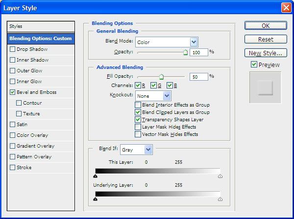
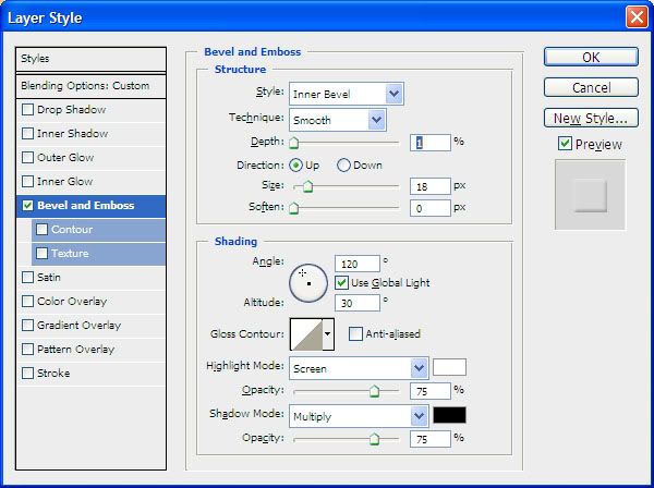
And I’m done! Voila!
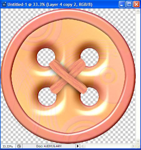
Don’t forget to delete your black background layer when you’re done, Merge all of your layers, and then go to Image > Trim > Trim by Transparent Pixels. Save as a .png file to preserve transparency.
You can download this button and 5 others that I created with this same method here
I hope this tutorial has been helpful. It will be posted in my store’s forum’s Designing 101 section soon. Watch for more Designing 101 tutorials to come out soon, as well. If you have suggestions or thoughts about this tutorial or any other, please don’t hesitate to post at the Digiscrapilicious forum (http://forum.digiscrapilicious.com/phpBB3/index.php)
Happy scrapping!

No comments:
Post a Comment